“For five thousand years we have had geographical maps, and for three thousand years these maps have contributed to the mental image the man has of the world. Scientists, historians, popes, researchers, navigators have drawn maps, but the cartographer as a professional figure has only existed for 400 years. As a historian with an interest in geography, I have studied the history of cartography with particular attention. I realized the inadequacy of existing land maps, which did not favor, among other things, the best solution to the problem of transporting the earth’s surface on a flat sheet. The new world map, my Chart, represents all the countries of the Earth in an equal way. “
(A.Peters)
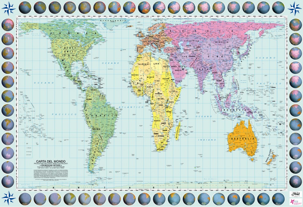
What you see is the Peters Chart. Those who do not know it will find it rather bizarre. In every Atlas we have come across, we have been used to seeing a more traditional map, the so-called “Mercator Map”, made precisely with that projection. You have noticed it: it is completely different. Why?
It is important for us to explain this unusual Chart and to clarify why our Atlas chooses to use the “Peters projection” instead. To sum it up: In 1569, Gerardus Mercator, a famous Flemish cartographer, drew the map that took his name. Keep in mind that he was a man on the run, under investigation for various reasons. His projection did not immediately become popular: indeed, at the beginning it was not accepted. After 30 years of uncertainty, it was welcomed and widespread, especially used by navigators of the 1600s, since it drew horizontal and vertical lines, creating new points of reference and thus favoring those who sailed and plotted a route in open sea. In reality, Mercator’s projection deforms the areas, the countries’ surfaces, due to the earth’s curvature. The closer we get to the poles, the more the surface increases, creating problems in understanding reality. Conventionally, however, over the centuries it has become our vision of the world, even if it does not represent the planet closely.
A historian has tried to design a map that respects the real surfaces of the continents and the effective dimension of the States. It was Arno Peters, the German historian who oly succeeded in doing so in 1973. He did it, of course, also for ideal reasons. Peters had written several interesting books: among others, in 1952 he had published the Optically Synchronic History of the World. He aimed to recover, by respecting the effective dimensions of each individual country, the dignity of each people, its size in the world.
In short, what motivated him was an anti-colonial logic, which gave the South of the world the same importance as the North. Knowing that every projection of the sphere on the plane mandates deformations, Peters realized that the exact proportion of the surfaces was at the expense of the accuracy of the distances. The continents thus took on an elongated shape.
In this illustration, you can find the two maps in comparison:
He, however, proposed this projection, which presents these characteristics:
- Fidelity to the surface: each area (country, continent, sea) is represented according to its real dimensions.
- Position fidelity: all East-West lines are parallel and horizontal. The relationship of any point on the map with its distance from the equator is immediately identifiable.
- Fidelity to the axis: all the North-South lines are vertical. The position of each point is immediately verifiable in terms of meridian or time zone.
- Totality: the earth is completely represented, without any “cuts” or double representations.
- Regularity in the distribution of errors: not all errors are concentrated in the areas farthest from Europe, which instead was the logic of the Europe-centric Mercator Maps.
- Base colors for each continent: Traditionally, colonies were depicted in the same color as their colonizing states. Peters chooses a base color for each continent and assigns variants to the individual countries, to highlight their affinities and common roots.
This Map and its characteristics become fundamental in our Atlas. This choice is conscious, because we believe that this is the correct view of the world – not shy of its problems and contradictions, but more consistent to the principles moving our project.
We have adopted this projection to give consistency to our work, which is also geographical. In our Atlas of Wars you will find that, in the individual country analysis, the maps used are traditional: there is a logic. Each state, from a satellite photography, is identical to its projection on a map: the vicinity reduces the margins of error presented in a planisphere. As such maps do not undergo deformations, It is pointless to change them in this case.
We want to thank the Italian NGO Asal that allowed us to use this Charter and with which we collaborated for the use of this Map in the Atlas.


